Prezi is a presentation tool that helps transform lack-luster, static presentations into engaging presentations that tell a story.
Instead of moving slide to slide, like a PowerPoint or Keynote presentation, Prezi presentations capture content in a spatial context. Because of this, your audience may be more engaged with your presentation.
If you?ve been using PowerPoint, you can import an existing PowerPoint presentation and transform it into a Prezi.
Let?s take a look at some example presentations using Prezi that demonstrate how this tool can be used to take your presentations to the next level.

This Prezi shows the company?s history, some of the people using Prezi, and how to import a PowerPoint and get started with Prezi.
This is a great example of how to effectively use Prezi and also gives you an idea of the features you will find in the program. It does a great job of illustrating Prezi?s story using imags, facts and statistics.
By featuring a how-to on importing a PowerPoint file, Prezi highlights one of it?s main selling points.
To close, showing specific examples of people who use Prezi is a great way to show the value Prezi brings to a market that otherwise hasn?t seen much innovation.

This Prezi states the simple facts about each candidate in the 2012 election. The presentation flows from one segment to the next rather than jumping from slide to slide.
It presents the facts in an understandable way, and because of the format and segmented design, it?s easy to compare the two candidates.
Most successful presentations end in some sort of call to action. Appropriately, this one calls you to vote!

Russel (The Prezenter) Anderson-Williams wrote the book on using Prezi for business presentations (literally!). This is his presentation to promote his book.
In it, he uses embedded video, audio and hyperlinks to tell his story and walks the listener through how to do all these things within Prezi.
The illustrative style of the presentation puts the watcher in the learning seat which goes hand-in-hand with the educational nature of the presentation. Tying the design to the objective of the presentation helps make this Prezi successful.
To conclude the presentation, there are a couple calls to action including clicking on links to purchase the book and signing up for his online Prezi training course.

In this Prezi about how to effectively make a Prezi, the presenter walks you through the reasons why Prezi?s format is conducive to creating a memorable experience and triggering action among your audience.
It walks you through important aspects of any presentation, like making you feel emotion and telling a story, while also showcasing the templates and features Prezi has available.
The presentation is sprinkled with facts and examples throughout, which adds interest and lends credibility to the presenter.

Can Prezi make learning about the theory of relativity fun? See for yourself in this great Prezi created by Petra Marjai.
The Prezi tells the story of how the theory came about and also uses illustrative examples from everyday life to explain the theory.
Aside from great story telling and examples, this Prezi is also a great example because of the simple color palette that is used consistently throughout the presentation.
Another of its successes is good typographic hierarchy. The main points are in large text, while the smaller points are in smaller text ? similar to cascading bullet points in a traditional PowerPoint, but much more differentiated and engaging.

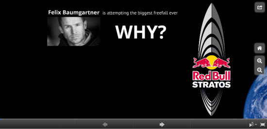
This Prezi on the Red Bull Stratos free-fall stunt was created to tell the story around the stunt. It gives background on the purpose, facts and goals about the process as well as a link to more information. It also utilizes an embedded video and link.
The last screen of the presentation shows the full context of the story in one large view. With longer presentations, it might not be realistic to zoom out and show the whole story in one view, but for a short story like this, it?s a great method to show how all the points relate back to the larger context of the story.

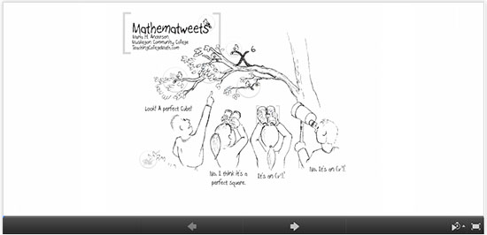
This last example of a successful Prezi was created by Maria Andersen to illustrate how Twitter can be used in the education system. It uses well-crafted illustrations to go beyond teaching about what Twitter is and how it can be used, to telling the story of how it was used (both successfully and unsuccessfully) in the cyber classroom.
The illustrator uses cartoon people and branches of a tree to ask and answer questions, seamlessly transitioning from point to point and question to question. The branches and people, and the ability to see the entire frame in view at once, shows the correlation and context of the various questions and answers.
A call to action, story telling, and using spatial context to visualize ideas are all key elements that make these presentations successful.
Have you used Prezi??? Do you have a link to your Prezi presentation?? What do you think are the advantages and disadvantages of Prezi over PowerPoint and Keynote?
About the Author: Angela Noble is a freelance designer and copywriter from St. Charles, Illinois. She specializes in print and web design. You can find out more about her and view her portfolio at http://angelanoble.com or follow her on Twitter @DesignByAnge.
Get our Newsletter
Exclusive tips on design and conversion optimization
Source: http://blog.crazyegg.com/2012/10/29/example-presentations-using-prezi/
euro 2012 dominion power Colorado Springs pga tour Nora Ephron mario balotelli mario balotelli
No comments:
Post a Comment
Note: Only a member of this blog may post a comment.